



UI/UX Design 24 Aug 2026
Why Good UI/UX Design Directly Impacts Your Conversion Rate

Written by Kalpesh Prajapati
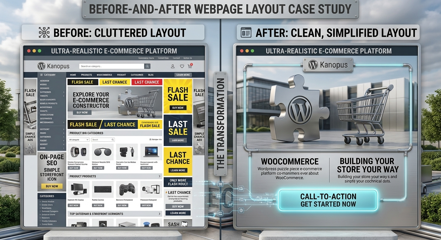
Two websites can sell the exact same product, at the exact same price, to the exact same audience, and still see wildly different conversion rates. The difference usually isn’t the offer. It’s whether visitors can actually find, understand, and trust what they’re looking at within the first few seconds on the page.
Businesses often assume a conversion problem is a marketing problem, more traffic, better ads, a bigger budget. Sometimes it genuinely is. But just as often, the traffic is already there, and the design of the page itself is quietly turning interested visitors away before they ever reach a decision point.
What UI and UX Actually Mean (and Why They’re Not the Same Thing)
UI, or user interface, refers to the visual layer: colors, buttons, typography, spacing, and how everything looks on screen. UX, or user experience, refers to the overall journey: how easily someone can navigate, find information, and complete an action like making a purchase or submitting an inquiry. A site can look polished (strong UI) while still being confusing to navigate (weak UX), or vice versa. Conversion rates depend on getting both right together.
How Design Decisions Quietly Affect Conversions
Button placement and contrast determine whether a call-to-action gets noticed or gets lost against the rest of the page. Perceived load speed, driven partly by how a page is designed to render, affects whether visitors stick around long enough to see an offer at all. Form length and friction directly influence whether someone completes a signup or inquiry, or abandons it halfway through. Mobile usability matters even more than desktop for most businesses now, since a large share of traffic arrives on a phone. And visual hierarchy, the order in which a visitor’s eye naturally moves across a page, either guides someone toward a decision or leaves them scanning aimlessly.
Common Design Mistakes That Quietly Kill Conversions
Cluttered pages with too many competing elements make it hard for a visitor to know what to focus on. Unclear or generic calls-to-action (‘Submit’ instead of something specific like ‘Get My Free Quote’) reduce click-through. Inconsistent navigation across pages breaks trust and makes a site feel unfinished. Long forms asking for unnecessary information increase abandonment. And a design that wasn’t built mobile-first often feels cramped or broken on the device most visitors are actually using.
How to Know If Your Website’s Design Is the Problem
A high bounce rate combined with short time-on-page often points to a design or first-impression problem rather than a content or offer problem. High traffic paired with low conversions suggests visitors are arriving but not being guided toward action. Cart abandonment on eCommerce sites frequently traces back to checkout friction, an area where small design changes tend to have an outsized impact. Tools like heatmaps and session recordings can show exactly where visitors hesitate, scroll past, or drop off.
Small Design Changes That Often Make a Big Difference
Simplifying navigation down to the essentials, keeping one clear primary call-to-action per page instead of competing options, reducing form fields to only what’s truly necessary, improving color contrast on buttons and key text, and reviewing the mobile layout separately rather than assuming the desktop design translates well, these changes are relatively small to implement but consistently move the needle on conversion rates.
Why Trust Signals Are a Design Problem, Not Just a Content Problem
Businesses often treat trust, testimonials, certifications, guarantees, contact information, as purely a content question: what to say. But where and how that information is displayed is a design decision that matters just as much as the words themselves. A testimonial buried at the bottom of a long page does far less work than one placed near a decision point, right beside a pricing table or a signup form, where a hesitant visitor actually needs the reassurance.
The same applies to contact information and business credibility markers. A visitor who can’t quickly find a phone number, address, or clear sign that a business is legitimate is far more likely to bounce, regardless of how good the product or service actually is. Good UX design treats trust-building as part of the layout strategy, not an afterthought added wherever there’s leftover space.
Designing for the Visitor Who Isn’t Ready to Buy Yet
Most website visitors, especially on a first visit, aren’t ready to convert immediately. Good UX design accounts for this by offering a lower-commitment next step alongside the primary call-to-action: a way to learn more, download a guide, or save the page for later, rather than forcing an all-or-nothing choice between buying now or leaving. Sites that only design for the ready-to-buy visitor often lose a large share of traffic that would have converted later, with a bit more nurturing.
This is especially relevant for higher-consideration purchases, custom software, larger purchases, or long-term service commitments, where visitors typically research across multiple sessions before deciding. Designing a clear, low-friction path for these visitors to stay engaged (through email signup, a resource download, or a simple inquiry form) captures value that a purely transaction-focused design leaves on the table.
Testing Design Changes Instead of Guessing
The businesses that consistently improve conversion rates over time treat design as something to test, not something to finalize once and leave alone. A/B testing a single element, a headline, a button color, the order of steps in a checkout, gives concrete evidence of what actually moves the needle for a specific audience, rather than relying on general best practices that may or may not apply to a given business.
This doesn’t require constant redesigns. Even testing one meaningful change per month, backed by real visitor data rather than internal opinion, compounds into a noticeably better-performing website over the course of a year.
Why Consistency Across Pages Matters More Than Any Single Page
A single beautifully designed landing page can still underperform if the rest of the site feels disconnected from it, different navigation styles, inconsistent button treatments, mismatched tone between pages. Visitors notice inconsistency even when they can’t articulate exactly what feels off, and that subtle friction erodes trust just as much as an obvious design flaw would.
This is why UI/UX work is most effective when it’s treated as a system rather than a series of individually polished pages. A consistent design language, colors, typography, spacing, button styles, applied across an entire site builds a sense of professionalism and reliability that compounds across every page a visitor sees, not just the one they landed on first.
Where to Start If Your Budget Is Limited
A full redesign isn’t always realistic, and it isn’t always necessary. Businesses working with a limited budget tend to see the strongest return by focusing first on the pages with the most traffic and the clearest conversion goal, usually a homepage, a core service or product page, and the checkout or inquiry form. Auditing just these few pages for clarity, mobile usability, and CTA visibility often surfaces the highest-impact fixes without requiring a site-wide overhaul.
From there, improvements can be rolled out gradually to the rest of the site as budget allows, using what worked on the highest-traffic pages as a template for the rest. This staged approach spreads out cost while still addressing the pages doing the most work for the business first.
Designing for Accessibility Helps Every Visitor, Not Just Some
Accessibility is often framed as a compliance checkbox, but designing for it, sufficient color contrast, clear focus states, readable font sizes, logical tab order for keyboard navigation, tends to improve the experience for every visitor, not only those using assistive technology. A site with strong color contrast is easier to read in bright sunlight on a phone. Clear, generously sized buttons are easier to tap accurately for everyone, not just users with motor impairments. Simple, predictable navigation reduces cognitive load for a rushed visitor just as much as it helps someone using a screen reader.
Treating accessibility as core to good design, rather than a separate add-on step at the end of a project, consistently produces a cleaner, more usable site overall, and avoids the scramble of retrofitting accessibility fixes after a site has already launched. It’s a genuinely rare case in web design where doing the right thing and doing the commercially smart thing point in exactly the same direction.
How Kanopus Approaches UI/UX on Every Project
Design work on our end always starts before any code gets written, wireframes, user flow mapping, and prototype review with the client, so structural issues get caught while they’re still easy and cheap to change. We look specifically at where a visitor’s attention naturally goes on each page, whether the primary call-to-action is genuinely the most visually prominent element, and whether the mobile experience was designed intentionally or just adapted from the desktop layout after the fact. That early attention is usually the difference between a website that merely looks good and one that actually performs.
Frequently Asked Questions
UI design is the visual layer, how a website looks. UX design is the overall experience, how easily someone can navigate and complete an action. Both work together to shape how a site performs, and neither one alone is enough to produce a genuinely effective website.
It varies by site and industry, but businesses commonly see meaningful conversion improvements from targeted changes like simplifying forms, improving CTA visibility, and fixing mobile usability issues, sometimes without changing the offer or pricing at all.
Small, targeted changes often help significantly without requiring a full redesign, especially when the core issue is something specific like form length, CTA clarity, or mobile layout rather than the overall visual style.
Signs include high bounce rates, high traffic with low conversions, or high cart abandonment. Heatmaps and session recordings can pinpoint exactly where visitors are losing interest or getting stuck.
Design should happen before development, through wireframes and prototypes, so the structure and flow are tested and refined before any code is written, which saves significant costly rework later in the project.